Interpretation Guide
On this page, the charts used in Project Patient Voice are further explained using the example of patient-reported nausea
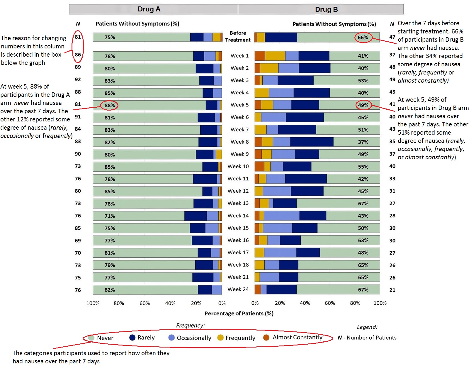
The bar charts show the percent of patients reporting how often they had the symptom over six months. In many trials, less than half of the trial participants are still taking the drug at six months. The main reasons that trial participants stop taking the drug include progressive (worsening) disease, death, and drug toxicity. As these charts capture only the first six months on treatment, they do not reflect patient reports of symptoms that appear after the first 6 months of treatment and may not show the pattern of worsening/improving that may occur with certain symptoms as treatment continues (e.g., nausea, neuropathy). The bar charts include the number of trial participants who were still taking the drug at each week. Each bar represents a week and the colors correspond to the responses trial participants gave. On the outside of the bar graph under “N” are the number of participants who gave a response that week. The percentage in the green space is the group of patients who did not have the symptom that week.
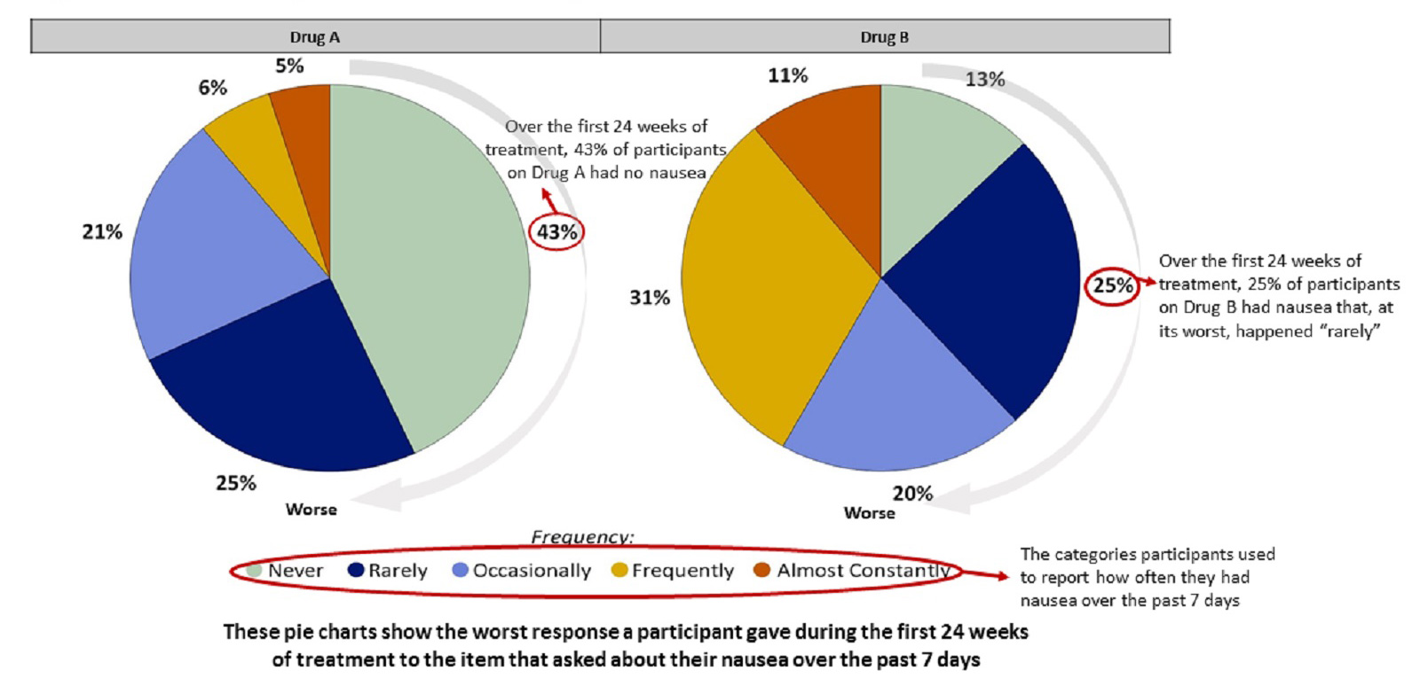
The pie charts show the worst response a participant gave during the first 24 weeks of taking the drug. For example, at week 4, a participant might have reported “frequent” nausea, but after week 4 their nausea was occurring “occasionally” (representing an improvement). In the pie chart, this participant would be counted in the area of the pie chart representing “frequently”, because that was their worst nausea score.
Example: Nausea
In the study, patients were asked: "In the last 7 days, how OFTEN did you have NAUSEA?"
Patients scored how often they had Nausea on a 5-point scale (Never, Rarely, Occasionally, Frequently, Almost Constantly)
All Patients Who Completed the Questionnaire Described Their Experience of Nausea During the First 24 Weeks on Treatment:
Figure 1 shows the percent of patients reporting how often they had Nausea at each time point. For example, at week 2, 20% of patients taking Drug A had Nausea (ranging from Rarely to Frequently), while 80% reported no Nausea at the same time point. At week 5 there was the smallest number of patients with nausea (12%). At week 14 there was the largest number of patients with nausea (29%).
Figure 1. Patient-Reported Diarrhea During the First 24 Weeks on Treatment
All responses from patients' experiences just before and up to week 24 on-treatment were included in the analysis. Some patients did not report their symptoms every week, therefore the number of patients may change week to week. Furthermore, not all patients remained on the treatment for 24 weeks (e.g., some stopped treatment for worsening disease) which is one reason for the change in the number of patients over the course of treatment.
Worst Response Option for Nausea That Patients Reported During the First 24 Weeks on Treatment
Figure 2 shows the worst response option reported by patients for Nausea during the first 24 weeks on treatment. For example, for patients taking Drug A, 43% never reported Nausea and 6% reported Nausea that, at its worst, occurred Frequently during the first 24 weeks on treatment. For patients taking Drug B, 13% never reported Nausea, and 25% reported Nausea that, at its worst, occurred Rarely during the first 24 weeks on treatment.
Figure 2. Worst Patient-Reported Nausea During the First 24 Weeks on Treatment


